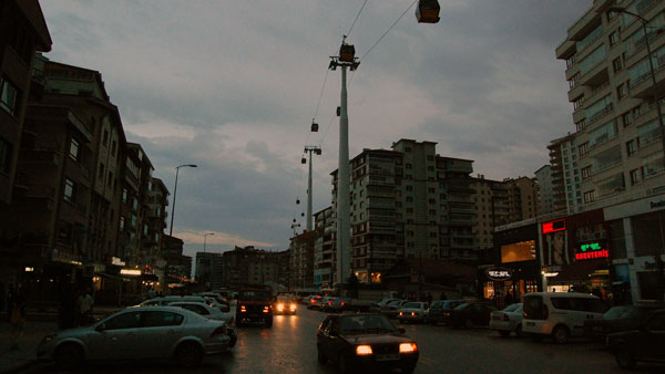
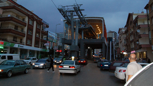
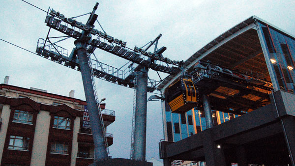
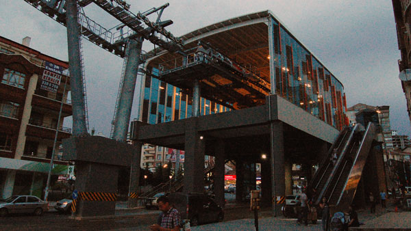
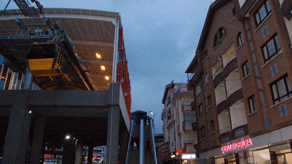
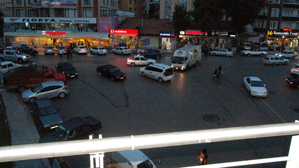
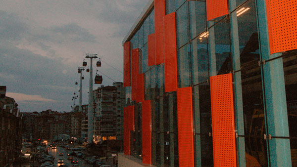
You cannot ignore Station Four (Şentepe Station) of the Yenimahalle Teleferik (Ankara Cable Car). It’s dominant in a most unexpected way. Like every other station along the Yenimahalle Teleferik before it, Station Four points the way to the future of urban gondolas and cable cars while not exactly mastering it. (You’ll have to excuse the photos. It was at sunset on a rainy overcast evening.) Like Station One, Station Four straddles the road, allowing pedestrians and cars to move below. And move they do. Whereas the environment around Station One was relatively placid and calm, Station Four’s surroundings are positively chaotic. The neighborhood of Şentepe around Station Four is a mishmash of mid-rise residential, street-level commercial, roadside parking, Vefa Park and what resembles a traffic circle — if only it was actually circular. Cars and pedestrians dart below, around, up and down the station with abandon. I observed families riding the cable car for fun while teenagers hung outside on its platforms smoking cigarettes and gossiping. It was the kind of street-level animation that critics of elevated infrastructure claim would disappear should anything overhead ever be constructed. Clearly the residents of Şentepe didn’t get that memo because—at least when I was there—the area was positively hopping.
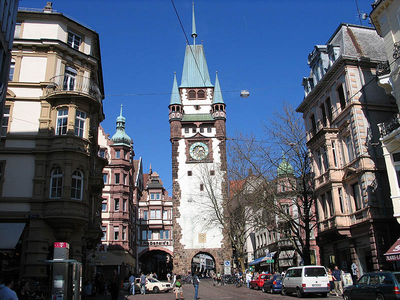
As I’ve argued before, criticisms against overhead infrastructure are always half-baked at best. They’re typically cherry-picked from examples of infrastructure that didn’t just fly over an area but demolished existing buildings and neighborhoods at the same time. Take Toronto’s Gardiner Expressway. Did it destroy the urban fabric? Absolutely — because its construction demolished existing neighborhoods. That’s not what happened here. You can clearly see that Station Four avoided any such demolition whilst providing a much-needed transportation system capable of moving tens of thousands of people per day. That’s an accomplishment to celebrate. Şentepe’s example and others like it disprove the Elevated-Infrastructure-Kills-Cities argument; or at the very least demonstrate that blanket positions against elevated infrastructure are ignorant of the myriad of examples where it clearly works. That’s not to say the Şentepe station is perfect. Like Stations One and Two, its street-level integration with the overall urban fabric is poor. The station in general just doesn’t feel at ease with its surroundings. Again, this isn’t a question of an elevated station with uses occurring above street level. This kind of thing is done all the time, but needs to be done with a careful consideration of the surrounding uses. Example? Freiburg, Germany’s old town features a similar configuration of buildings. The Martinstor straddles a mixed-use road and set of tram tracks. It isn’t positioned as a building, however—it’s a gate that intimately addresses the surrounding urban structure. It’s also one of the most touristed and photographed areas of the city.
This problem is particularly articulated on the Şentepe station’s eastern façade. It’s mere meters from the windows of residential dwellings. Escalators, meanwhile, bring system riders to a height that compromises all privacy.
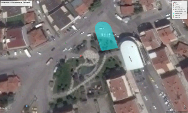
You could never get away with this design in the west. And I’m not sure you should get away with this design anywhere. If I lived in any of those apartments, just the thought of the thousands of commuters passing by my bedroom window every day would cause me to start looking for new lodgings. What’s so curious about this design is that it wasn’t necessary. Viewing from above, you’d see Şentepe had more than enough room to the northwest of the existing site to realize a station without such a severe impact on residential privacy.
Granted, it would’ve needed to be a much taller station to get the required clearance over the surrounding buildings, which of course, would’ve entailed greater costs. But as we discussed with Station Two, street-level retail and above-grade commercial activities in the station could convert this “problem” into a monetization opportunity. A taller station needn’t be a problem if that excess height is leased out as real estate. Such changes, furthermore, would’ve required adjustments to the traffic “circle” and the acquisition of some park land. Those aren’t deal-breakers, but they do make things more complicated. Even with these modifications, wouldn’t the result have been better for the whole neighborhood? Another eye-catching aspect of Şentepe station is how it eschews that ribbed white-steel aesthetic that so characterizes the system’s first three stations. Those I interviewed said the reason had to with maintenance (which I highlighted in a previous post).
Apparently, maintenance standards in Ankara are such that the accumulation of dust on the steel ribs of the original stations dismayed civic leaders so much so that a new design was introduced to eliminate that problem. And without doubt the new station certainly looks cleaner and newer — because it is cleaner and newer. Station Four is the end station of a new section that was just opened months ago whereas the first three stations have been in use for over a year. Today, there’s no reason to believe the new design will provide cover for maintenance problems. Poorly maintained glass can age just as badly (if not worse) as any other material. If the problem with the original designs is one of maintenance, shouldn’t they fix the maintenance regime and not the station designs? But that’s neither here nor there. Only time will tell if this design change has the intended affect. Perhaps it’s a genius move or perhaps it’s simply shaving the bear.
ANKARA SERIES

